Saturday, July 19, 2008
Perlman Center PMFA
I'm usually impressed by the shows at the PMFA . We go quite often, probably almost once a month. While there permanent collection is lovely, what's on display isn't enormous like say the Met. But they always seem to be tweaking and changing the installations to provide surprise and meat for regular visitors. There are also always small shows, tucked away little gems. Honestly these days I like smaller shows. A few healthy bites and then a coffee break to chew on them.
This visit there were two cool little shows in the Perlman building.
I was looking forward to the Calder Jewelry show and it more than delivered. I have never been a huge Calder fan. I guess his Mobiles were at on time surprising. Unfortunately they now strike me as nursery playthings from a Design within Reach catalog. I know that's not his fault, but as a viewer I bring me own baggage historical and otherwise and there you are. Sometimes you can't see the freshness in older work. Oh and the Stabiles are just not my monumental cup of tea. All that steel and public space. And those that are small strike me as maquettes. Can't argue with them but they leave me lukewarm. I'm just not a fan of big steel sculpture, (of course I adore Richard Serra).
The jewelry on the other hand is space and changing without losing it's gravity. You feel like you would be changed in some basic way by wearing a cagelike necklace or a huge animal brooch drawn in silver. The pieces appear simple and fundamental although they probably looked radical in the 30's and 40's. But you know like any elemental art that maybe you could copy the form, making such a drawing takes a lifetime and vision most of us lack. It's a must see show that made me see Calder freshly.
Hello! Fashion: Kansai Yamamoto 1971-73 is a crazy small installation, with a video 6 or 8 "dresses" by Yamamoto and a few background pieces by other Japanese designers. The other designers like Comme de Garcons et al. are all cool, black and Zen-y while Yamamoto is Pop and Kabuki. What sticks most in my quirky (and campy) memory is that this 1973 collection made it's American debut at Hess's in Allentown. I've was at that Hess's in the late 80's ( a long story) and there was absolutely no evidence of it having ever been a hot bed of fashion. Somehow I imagine that there's a story involving a socialite with a vision and the money to bring Avant Guard-ness to Allentown.
I didn't know of the designer and the work was great. There was a great crazy 1970's Samurai dress and headpiece (gift of Hess's....they must not have been big sellers). Also some pants and a dress that when they opened formed a full circle. A visual treat and inspiring little show.
Sunday, June 08, 2008
Mike's World ICA
"Mike's World" is a dense, cacophonous installation in the main gallery at the ICA. After entering an uncluttered black cube with a snarky and appropiate introduction to Mike's World you enter a space visually and aurally assaulting with many installations, videos, installation with video , works on paper and ephemera. I get easily overwhelmed, sometimes by Stendhal Syndrome and sometimes something more like ADD. I was not overwhelmed by beauty so it wasn't Stendhal. This is a dense presentation of three decades of work by Michael Smith and collaborators. He's an artist I'm surpised I haven't heard of. Especially in the 80's I thought I followed performance and installation especially involvolving identity and institutional critique.
My favourite piece was the instantly readable "home fallout snack bar", a recreation of a 1983 piece. For me it had a clarity and an easy way in. The snack bar/fallout shelter had a cool mix of paranoia and midcentury Americanness. Why not have a basement rec room that handily turns into a fallout shelter. The mix of a Lucy and Ricky aesthetic with the survivalist was strong. Visually the bunker with accompanying drawings was sleek and handsome. It also provoked a vision/nightmare of your neighbors paranoia. Somehow under the cheery , upbeat facade of "your typical" American lurks fear and insecurity.
Quinquag presents a fictional mid century artist colony morphing into a New Age wellness center with geodesic dome and all. This fictional colony was located in Woodstock NY. As a former resident of Woodstock I found this piece both a plausible fiction and a sharp edged satire. Mike's presenting of the older pre hippy communal arts colony was evocative of Woodstock's history. There were actually dualing splintered art colonies in 20th C Woodstock, (Byrdcliffe and Maverick}. Another colony known for artist made tiles and the model of rocking chair favoured by JFK struck me as unsurprising. The "artifacts" and historic taped interviews were dumb (in the good way) and evocative. The corporate sponsorship and idea of a "Wellness Center" on the historic ground of the colony was well imagined and funny. Believable and skewering . But as art I found it a little flat and one linerish. More a piece of satire on the old Daily Show and not as evocative and artful as the Snack Bar/fallout shelter.
I liked this show. Funny, smart and well crafted. But in retrospect it seemed a little lightweight. I also think maybe it's cheery face and for me empty calories were the point? Somehow I felt entertained an amused but a little undernourished.
Saturday, May 17, 2008
Jennifer Bartlett at Locks
I'm new to the Philly scene but Locks Gallery seems like a venerable, blue chip gallery. Usually not really my cup of tea. They sure have lively shows in an architectuarly significant building though. I like the way the white cubed gallery spaces are carefully shoehorned into what I imagine were the original ballroom and another smaller space. I love climbing the ornate staircase to the upstairs space. Last month we saw a refreshing eye opening show of Lynda Benglis. It's nice to see a historical figure (I hope she would take that the right way), in a small retrospective which sheds light on current practice. Benglis certainly foremothers many current concerns around gender, physicality and sexuality.
The current Bartlett show revisits important work from the seventies which has been laid out of sight a bit. Bartlett does us a great service by revisiting it herself in her mammoth new work "Song" from 2007. It's abstract though less rigorously so than the plate pieces from the seventies . But certainly less figurative than work I remember from the eighties There's the image of the phases of the moon et al. I think it takes her more figurative house and other images back around to a new place. Seeing her plate graphs from the early seventies reminds us of what was happening in the seventies bridging minimalism and the coming figuration, identity, and narrative work that now seems so vital. Ultimately I find her work not very deep but I'm always interested.
Also check out Kate Bright's glittery, wintery landscapes.
Friday, May 09, 2008
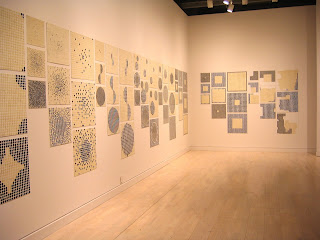
Carlos Amorales PMFA
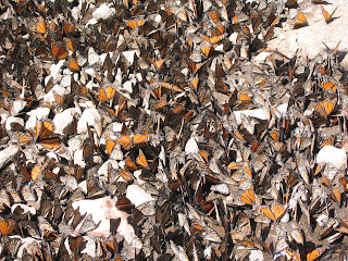
MONARCH SANCTUARY
AMORALES INSTALLATION
I was mildly jolted with deja Vu approaching Amorales' installation in the Modern wing of the museum. It really evoked for me the monarch butterfly sanctuary at Agangueo, in central Mexico. The black paper swarms of moths or butterflies brought back my response to the beauty and slight menace of the sanctuary where the monarch butterflies winter. It's a mysterious place where unimaginable masses of butterflies swarm over the trees and ground in their mountain sanctuary in the Guanajanto state of Mexico. The more singular masses of butterflies are gorgeous, but when they swarm into gigantic black masses obscuring the trees you sense a dark edge. It's a mysterious spiritual journey on the top of a winding mountains road. The butterfy clumps become huge objects and organisms.
Amorales captures, for me, a bit of this natural and spiritual phenomenon with his installation. As far as I can tell there is no direct reference to the monarch sanctuary, but this Mexico city artist evoked it for me. It might just be my reference point since it surely also evokes horror scenes, like in "The Birds" when Tipi Hedron is slowly surrounded by birds who when they mass move from natural beauty quickly into frightening menace.
This is a crowd pleaser. People were stopped in their tracks. I especially like that a small group of the moths had migrated into the chapel and sanctuary of the Modiglianis. That's how the monarchs in Mexico are. As you approached you slowly noticed one or two butterflies then unusual amounts of them then overwhelming clumps.
Amorales' silouhette videos:were moving shadows, massing and unmassing evoking nature and narrative. They were quite lovely. LIke a puppet or light show more than animation. There are also three of four collage drawing adding another layer to this successful and evocative project.
Tuesday, May 06, 2008
Seen
Last Friday we made a short visit to Olde City to check out a few First Friday openings.
The seemingly hot show left me cold, "Vanitas" at Wexler Gallery. Maybe it's my aesthetic but I found the work overly luxe without much to interest . Maybe Wexler's focus on crafts and the beautiful Wendall Castle furniture and Dale Chilhauly bibelots placed around define the space. I thought the 250K Damien Hirst skull was emblematic. An expensive object as art. Maybe it's interesting in some context but in the show it struck me as not much except for a big price tag.
There were also these slightly perverse and slightly disturbing leather taxidermy dogs by Adelaide Paul which just weren't my cup of tea. They looked expensive, beautifully stitched leather over casts of dogs. You couldn't really argue with them but they brought to my mind expensive sex toys.
Also these wall mounted bell jar sculptures by Tim Tate with expensive looking electronics showing small videos. They weren't bad really they just didn't do enough for me. I looked at them for a bit but wanted more. I respond more to scruffy than precious I guess. Joe Boruchow showed these intricate paper cutouts which reminded me in a nice way of the Mexican festival paper banners. They piqued my interest to see more.
We also stopped in at Rodger Lapelle Gallery and saw Sarah Hunter's paintings of scrawly animals with lovely patches of paint. I adore these. My boyfriend wanted to just buy one but we're a little broke at the moment. I think she's fairly prolific as I think the first month we moved her (last september) she also had a show. I thought the work was even stronger this time. I remember more birds last time, which I liked but the newer work was a little more there. Cute birds are kind of on my cliche list. I was in Lowes the other day and they had these cute ceramic birds in the Garden department which looked stolen from the craft website "etsy" and a fair number of young painters. I digress these are beautiful paintings.
Lastly we saw at the Silicon galley digital prints by Judith Schechter. I thought the display of prints above the high tech printers in the old school printing space was fabulous. In my newness to the local scene I wasn't sure of the Artist's reputation but I think she's a well respected artist who seems to do these amazing stained glass scenes. An overlooked and cliched form such as stained glass seemed a brilliant medium. I looked though her monograph and my appetite was whet to see the originals. The prints on display were groovy . You could see the "craft" with her use of patterning and a weird flattened space. I also liked the portfolio of the suite of prints. It was a beautiful object with a seemingly artist designed fabric lining to the box which added.
So that was our quick trip through Olde City.
Sunday, May 04, 2008
Zoe Strauss I-95.08
THE perfect place for my start. I find Zoe Strauss's project incredibly compelling--her mixture of real community involvement and strong compelling images. I finally saw the installation and it was gorgeous, beautifully conceived and executed. I loved the urban space lightly swept and Zoe's well printed images carefully glued to the pillars. It was glorious to see people of all stripes milling about carefully examining the images.
A bit of confession. I stumbled upon Zoe's work first when she was in the Whitney Biennial. It struck me but until I started reading her blog (which I do almost daily) I didn't understand her project. While I wouldn't say her work was the impetus for our move to Philadelphia last summer it was an inspiration. I find her work regional in the best sense and it illuminated Philly's appeal to me. It's art grounded in a deeply loved place. Philadelphia's Arts culture seems to value community and public art much more than other places. I love the murals on every corner. Her project made me feel excited about our move and helped reveal a soulful and vibrant city.
I had a couple of realizations. Somehow I thought of her as a street photographer prowling the streets for artistic trophies. Instead she displays obvious sympathy for her subjects and environments and the portraits seem more collaborations with the subject than images snapped on the street. The shots of buildings, signage and urban details also display a formalism and art historical knowledge that is often poetic and moving. Kudos.
That said, although the images of streetscapes and signage may be critical to the project and it's narrative, I have questions. Which is a good, in my mind, because if I don't like the work I usually don't give it enough thought for questions to arise.
Sometimes I felt some images were "easy". A few seemed like obvious one liners that may have moved her story and installation forward but paled next to her (numerous) strongly felt and conceived images. I'm not sure this is even relevant since to the installation but occasionally I wished some images stood more strongly as singular images.
I mostly love the portraits. Although some of the signs and scenes, in my mind also have strong poetics and formal strength. I vividly remember "uniform city", a peeling phillies sign and a panelled wall with ghost rectangles of missing images. We didn't stick around to take an image from a pillar when the installation was over but it would have been a hard choice between "MLK Parade", "Tattoed Penises"...... or a dozen others.
A great installation. I look forward to next year as I suspect her work is always moving forward.
Subscribe to:
Posts (Atom)